

Project:
Design New Non-Profit Coffeehouse Website
May 2025
Summary:
worked with Shoreline Community Church to help launch their upcoming Coffeehouse “Liturgy Coffee” by creating an aesthetic front-facing website (through Squarespace), and a GR code ordering website on Square.
Responsibilities:
Website Design
Project Background
I was hired to create an aesthetic, easy-to-use website for a non-profit Coffeehouse opening in Summer 2025. I was given 6 weeks to finish the website (End of May, 2025). The scope was to create a 3-page website including a home page, a job application page, and an online merchandise page added later on once they start selling online.
I was asked earlier in the year for perspective on the Logos, graphics, and brand guide. This was a project I was thinking about for months, so when I was asked to create the website I had a ton of ideas and was very excited for the opportunity to design.
Not In-Scope
Something I did not anticipate was that not only need to create a website for Liturgy on Squarespace, but I also found out that to have mobile ordering, they would also need a whole separate website using Square. This website could be accessed through a QR code given by Square or a link. This was an issue because it would not be finished until Liturgy Coffee had purchased their Square equipment, email, domains, and menu. So, as I finished the front-facing website for Liturgy Coffee by the middle of May, the website on Square still needed to be discussed and worked on through the summer. Though this was an issue and would not be finished by the end of May, we wouldn’t need the Square website to be usable till opening, so I could work on it after the original project.
Brand Inspiration and Competitive Analysis
To help further define and brainstorm, I started by researching other coffeehouses in the area, as well as other coffeehouses that are supported by their churches.
For my competitive analysis, I looked at Ebezezers Coffee House in DC. I picked this because the design is extremely fun, exciting, and it keeps the brand separate from the church that supports it without it feeling like a “Chruch’s Coffee Shop”. In my design, I wanted to include similar “About us” sections, as I thought this touch was an easy way to not hide their identity, but not overexaggerate it.

Sketches and Wireframe
For my sketches, I drew each of the sections I knew they needed, which included:
Header
Welcome
Upcoming Events/Social Media
Menu
Merchandise
About us
Information (Hours, Days, Map, Location)
Footer
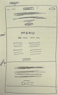

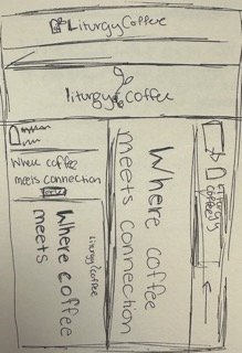
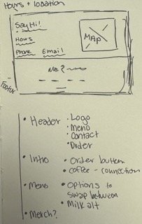
I drew up multiple low-fidelity mockups and then started to play with the ideas in Squarespace, seeing what they could fully do to make a fun, easy-to-use, and exciting website for the coffeehouse website.
Final Website
The Final website …
Outcomes and Learnings
This was my first time using Figma for interactive prototyping. I watched one of my teammates head on the interactive part of the prototype, and watching him do that gave me lots of inspiration for my next designs. I believe that there were some places where we cut corners to finish our project, but if I were to go back I would redo the slide that shows you the brand fonts, colors, and photography. I would make it more visually appealing as well as make it more understandable and usable.
This project pushed me even further to iterate, iterate, and iterate. Working on the same project for long periods of time, it can be hard to see a new perspective. This is why for my team, it was important we were receiving feedback from professors and other students. That is what helped us get a fresh perspective.
Thanks for Reading!